Restoring Trust in a Broken Inbox
How Clear Design Reduced Support Tickets by 30%

30%
Reduction in support tickets
18%
Drop in bounce rates
12%
Increase in message engagement
COMPANY
WP Engine
ROLE
Lead Product Designer
TEAM
UX Researcher
Product Manager
Engineering Team
TOOLS
Figma, Miro
Pendo
Jira
TIMELINE
4 weeks
The Problem
WP Engine's notification inbox was supposed to be the central hub for critical communications, but users were actively avoiding it because confusing features and unpredictable behavior made them lose trust in the system.
Why Users Were Avoiding the Inbox
30 seconds
Median session time (users fleeing quickly)
40%
Click-through rate (low engagement)
"Black hole"
User description of the inbox experience
What Users Were Telling Us
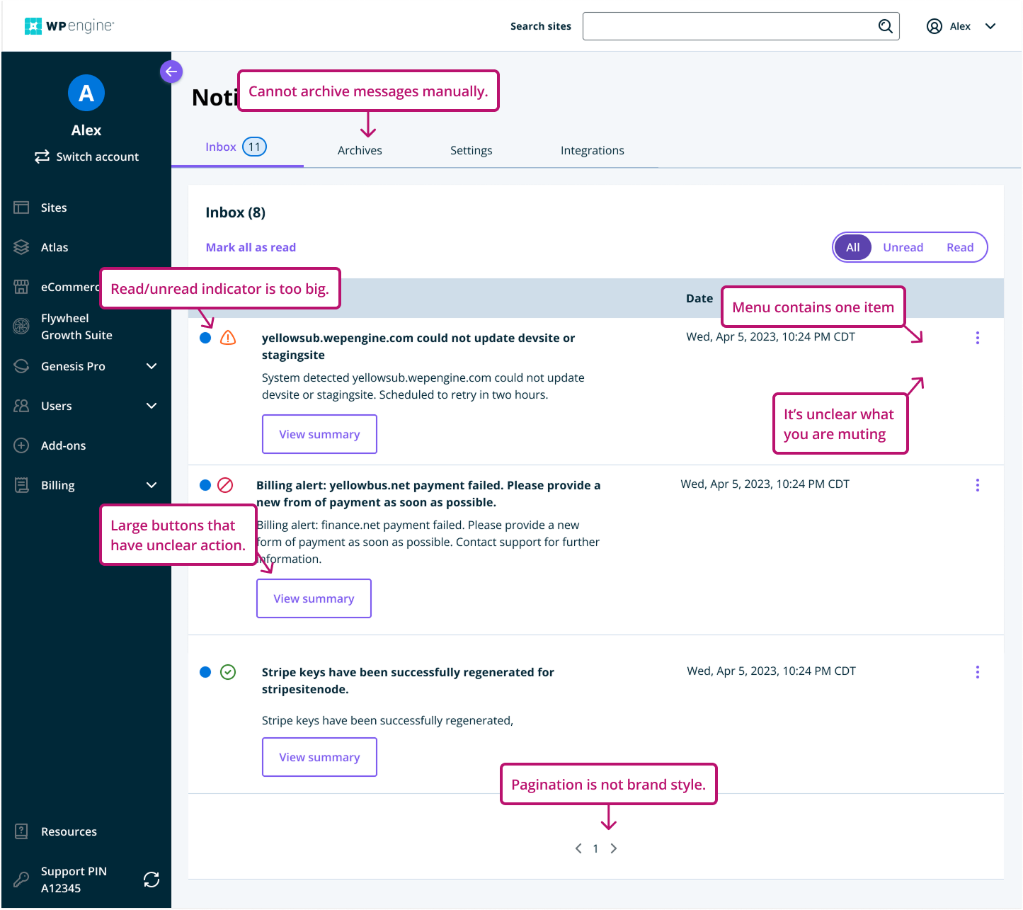
"I see the 'mute' option, but not sure what it does."
-Sarah G.
"The messages are so tall, I can only see a few at a time. It's really annoying."
-Mike R.
"I just wait for the email alerts — I only go to the inbox if I have to."
-Jennifer L.
Business Impact
Support Burden
Steady stream of confused users asking "What does mute do?"
Engineering/Design Debt
Inconsistent UI patterns and accumulated usability issues slowing development and requiring constant maintenance
Trust Issues
2 out of 3 users relied exclusively on email because they couldn't trust the inbox to work predictably
Research & Discovery
We used a mixed-methods approach to understand why users were avoiding a core product feature:
User Interviews
3 in-depth interviews with users who had recent inbox activity:
Users described the inbox as "unpredictable" and "messy"
2 out of 3 relied exclusively on email notiications instead
Couldn't predict what would happen when using "mute" feature
Interface felt disconnected from the rest of the platform
Pendo Analytics Analysis
Real usage behavior revealed the problems:

30 seconds
Median time spend (quick exits)
40%
Click-through rate on message threads
High bounce rate
Users entered and immediately left
Support Ticket Analysis
Audited 50 recent tickets over 90 days:
"What does 'mute' actually do?"
"Why am I still seeing muted threads?"
"Where did my old messages go?"
Design Strategy
Goal: Restore user confidence by making the inbox easier to interpret, quicker to navigate, and more predictable.
Clarity over ambiguity
Redesigned tooltips, modals, and toasts to provide immediate, contextual clarity about what actions would do.
Consistency with platform
Updated pagination design to match global table patterns used across the rest of the portal.
Reduce friction and noise
Reorganized content into tighter layout, moved CTAs to dedicated column, added filter functionality.
Design Process

Early Sketches & Wireframes
Explored solutions for the main pain points:
Muting behavior was unclear
Messages were too tall and visually dense
Pagination made it hard to browse threads
Constraints & Trade-offs
Infinite scroll vs. pagination: Wanted infinite scroll, but backend couldn't support it. Instead, updated pagination design and shortened message length.
Mute feature replacement: Wanted to remove it entirely, but required larger stakeholder discussion. Focused on improving copy and guidance instead.
Prioritization & Team Collaboration
Focused on problems causing most user frustration with least effort to fix:
First: Improving clarity around mute feature
Second: Reducing visual clutter for better scanning
Later: Major interaction changes (required backend work)
The Solution
Before

After
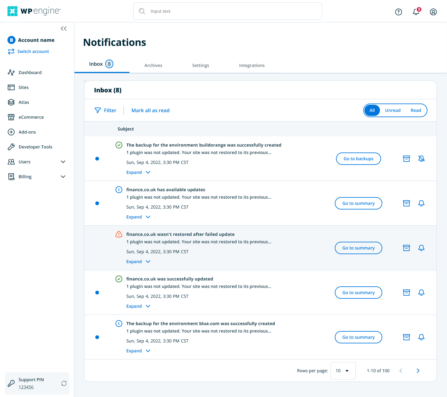
Mute Notifications Prototype

Key Design Decisions
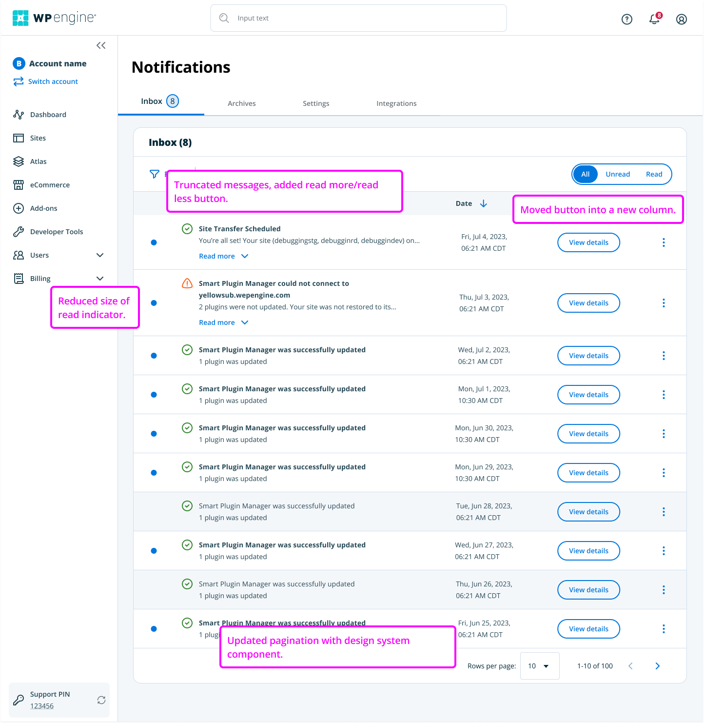
Restructured Message Cards
Problem:
Too tall, could only see a few messages at once
Solution:
Shortened height, moved CTAs to right column, resized UI elements
Impact:
Better scannability and predictability
Introduced Filters
Problem:
No way to narrow down view, inbox overload for power users
Solution:
Added filter control at top using familiar platform patterns
Impact:
Gave users agency and control over their view
Redesigned Mute Functionality
Problem:
Users didn't understand what "mute" did, messages reappeared unexpectedly
Solution:
Clear tooltips, plain-language modals, visual status indicators
Impact:
Rebuilt trust through predictable behavior
Updated Pagination
Problem:
Different style than rest of portal, frustrating navigation
Solution:
Matched global table pattern, shortened message height
Impact:
Improved consistency and reduced friction
Results & Impact
User Engagement Metrics
12%
Lift in click-through rates on message CTAs
18%
Drop in bounce rates suggesting better user orientation
14%
Decrease in time-on-page indicating more efficient navigation
Business Impact
30%
Decline in inbox-related support tickets over 60 days
0
New mute-related bugs reported (eliminated confusion)
Qualitative Feedback
"The inbox finally feels like something we can manage."
— Advisory Group Customer
"We used to avoid muting messages—we were not sure what would happen- now we feel like we
understand it."
What I Learned
Start Smaller, Ship Sooner
Small, well-targeted improvements delivered immediate value with less risk. Earn stakeholder trust by demonstrating value early.
Constraints Spark Creativity
Backend limitations pushed us to get creative with front-end solutions and microcopy without needing deep engineering work.
UX Debt Accumulates
Small flaws compound into major usability issues over time. Make time for proactive audits and continuous maintenance.
Clarity ≠ Completeness
Users didn't want more features — they wanted clarity. Better hierarchy and helpful labels made bigger impact than adding anything new.
Trust Through Visibility
Users didn't trust the system because it didn't explain itself. Surface system logic clearly, especially for "risky" actions.
Connection to Larger Impact
The inbox redesign validated our approach; informed the successful notification preferences redesign that followed, showing leadership that thoughtful UX changes deliver tangible business results.
Check out my other case studies.