Dell Design System
Contributing accessible, enterprise-scale components to Dell's global design system

10,000+
Component implementations
WCAG 2.1
Accessibility compliance
Global
Enterprise scale
COMPANY
Dell Technologies
ROLE
Product Designer
MISSION
Fill component backlog
with accessible designs
COMPONENTS
Tooltips, Dropdowns, Tables, Data Viz
TIMELINE
9 months
Contributing to Enterprise Design
Primary Challenge
Design accessible components meeting WCAG 2.1 standards for implementation across Dell.com, Apex strategic cloud platform, and 10,000+ digital experiences throughout Dell's ecosystem.
Enterprise Accessibility
Dedicated A11Y specialists to meet WCAG 2.1 compliance
Global Collaboration
Presenting designs to stakeholders across time zones and continents
Massive Scale
Designing for thousands of internal users
Business-Critical Platforms
Components deployed on Dell.com driving global e-commerce revenue and Apex hybrid cloud product enabling enterprise customers
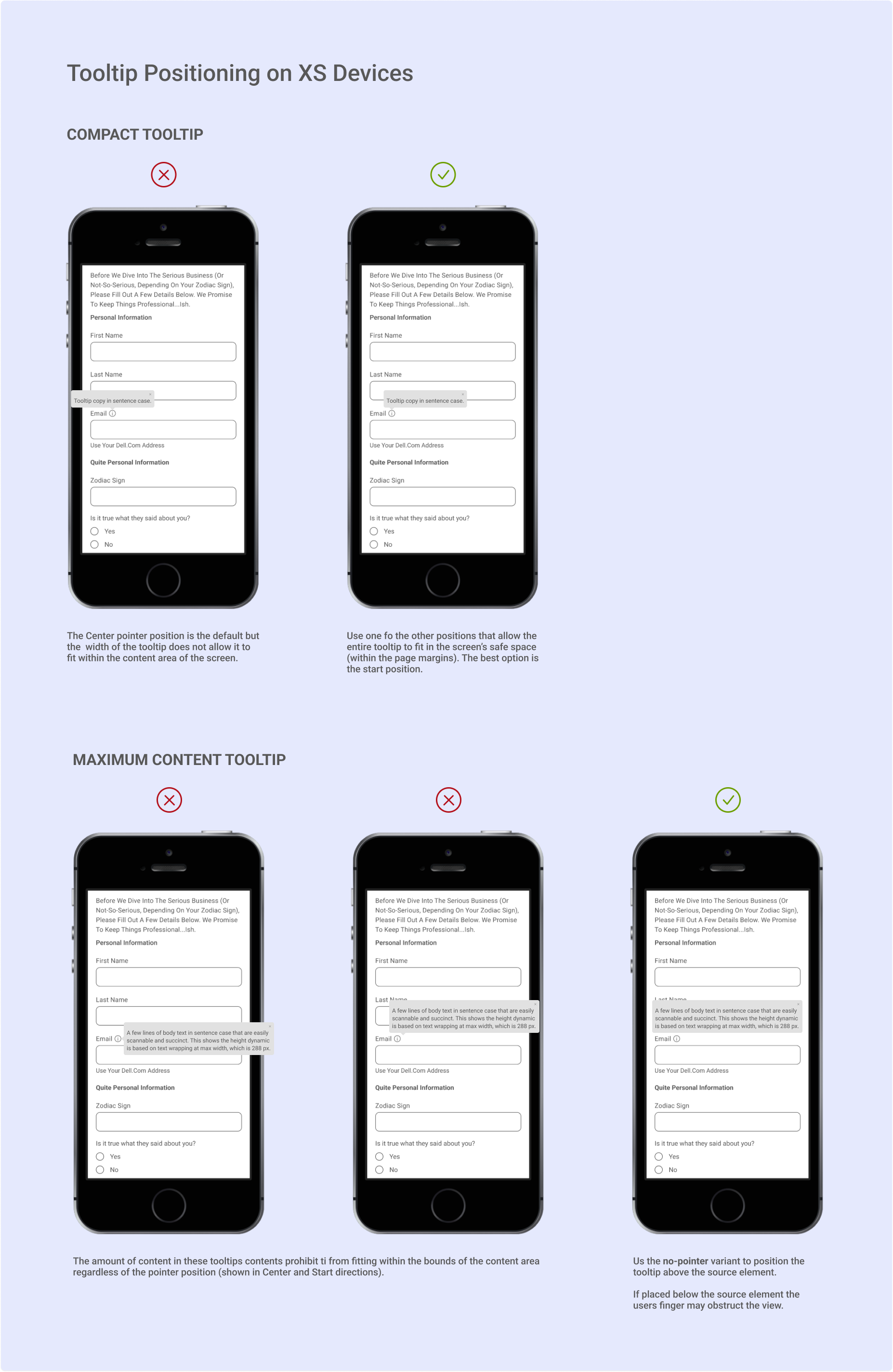
Tooltip Component
Challenge:
Needed contextual help that works across desktop and mobile devices
Research:
Analyzed other design systems and compared tooltips to popovers
Innovation:
Designed touchscreen interactions with tap-to-dismiss functionality
Standards:
Reviewed for accessibility, globalization, and developer handoff
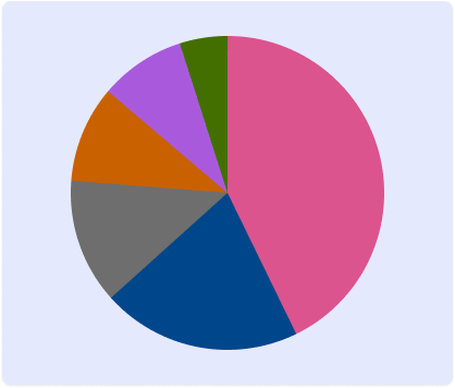
Pie Chart Component
Challenge:
Needed accessible data visualization for enterprise dashboards and reporting tools
Research:
Developed accessible color palette with high contrast ratios ensuring readability for color-blind users
Innovation:
Designed responsive charts with integrated tooltips and keyboard navigation for business intelligence
Standards:
Implemented data validation ensuring segments total 100% and comprehensive developer documentation


Dropdown Component
Scope:
Single-select, multi-select, and filterable options
Process:
Leveraged existing system components for consistency
Standards:
Reviewed for accessibility, globalization, and developer handoff
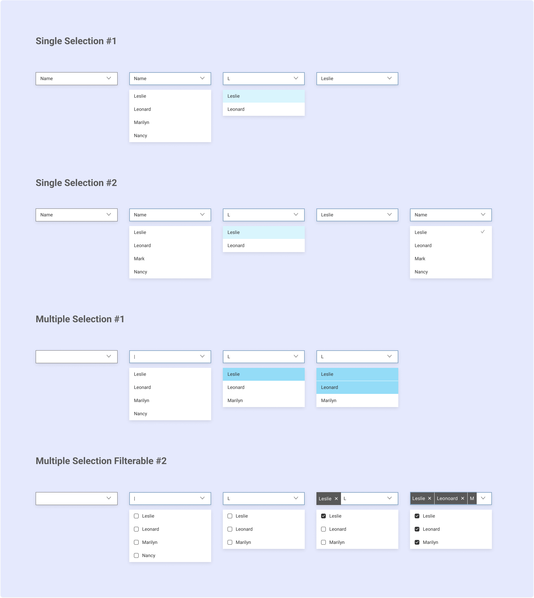
Table Component
Collaboration:
Cross-functional project with design and engineering teams
Comprehensive:
Five table size ranges with three density variants
Accessibility Learning:
Removed tooltip-in-header feature after A11Y testing revealed screen reader issues

Results & Impact
Strategic Business Value
Components deployed across Dell.com driving global e-commerce revenue
Integrated into Apex strategic hybrid cloud product for enterprise customers
WCAG 2.1 compliance met legal requirements and inclusive design commitments
Accessibility standards particularly critical for data visualization components
Scale & Adoption
10,000+ implementations across Dell Digital experiences
Measurable usage tracked through Figma insertion data
Consistent user experience across multiple products
Enterprise-level accessibility standards consistently applied
Engineering & Design Efficiency
Reduced defects and engineering overhead
Faster onboarding and enablement for engineers and designers
Smoother development processes and faster release cycles
Improved design consistency across Dell Digital platforms
What I Learned
Color Accessibility & WCAG Standards
Learning about contrast ratios, color accessibility, and WCAG 2.1 compliance became fundamental to how I approach all design work. This foundation has informed every project since.
Enterprise-Scale Design Impact
Seeing my components implemented 10,000+ times across business-critical platforms like Dell.com and Apex taught me how design decisions scale and the responsibility that comes with it.
Global Team Collaboration
Working with teams from around the world daily taught me how to present ideas across cultures, manage stakeholder feedback, and design for diverse user needs at enterprise scale.
Agile Methodologies
Participating in Sprint Reviews, Retrospectives, and Standups gave me experience in all stages of product development, from research and ideation to prototyping and testing.
This experience at Dell established my expertise in accessible design systems, global collaboration, and enterprise-scale component design that I've applied throughout my career.
Check out my other case studies.