
From 60% Abandonment to 50% Engagement

70%
Reduction in daily emails
65%
Reduction in support tickets
40%
Reduction in drop off rate
COMPANY
WP Engine
TEAM
UX Researcher
Product Manager
Engineering Team
ROLE
Lead Product Designer
TOOLS
Figma, Miro
Pendo
Jira
TIMELINE
8 weeks
The Problem
WP Engine's notification settings were driving customers away. Built by engineers without UX input, the interface was a confusing maze of technical jargon and unclear options that left users frustrated and overwhelmed.
20% of customers were receiving thousands of emails daily
One of our largest accounts was risking cancellation if we didn't fix the notifications ASAP
Support was fielding 30-50 notification-related tickets per week (spiking to 100 after system updates)
Users were either ignoring and/or missing critical alerts or considering canceling their accounts
The Stakes Were High
What Users Were Telling Us
“I’m getting hundreds of emails a day!”
“If I get one more email about something I don’t care about, I’m seriously going to turn everything off or cancel my account.”
“What do all these options mean?“
Research & Discovery
To understand the full scope of the problem, I conducted comprehensive research using multiple methods:
User Interviews
Customer conversations revealed deep frustration with the notification experience. Key themes included:
Inability to find or understand settings
Email overwhelm leading to ignoring all notifications
Confusion about technical terminology
Desire for granular control over notification frequency

Pendo Analytics Analysi

Support Ticket Analysis
Our support team confirmed this was a critical business problem:
30-50 tickets per week specifically about notification frustrations
75-100 tickets per week during peak periods (post-updates)
Common complaints: email overload, confusing settings, unclear labels, threats to cancel
Made this one of our top 3 support issues month over month
Design Strategy
Reduce Cognitive Load
Simplify the overwhelming interface through better information architecture and visual hierarchy.
Provide Granular Control
Give users the customization power they need without overwhelming them with options.
Design Process


Key concepts we explored:
Categorization by Features/Products → Group related notifications together
Categorization by Severity → Help users prioritize what matters most
Frequency Controls → Let users choose immediate vs. digest delivery
Clear Visual Hierarchy → Use typography, icons, and spacing strategically
Iterative Design & Feedback
Moving from sketches to wireframes, I presented progress at:
Weekly design pod workshops (5 designers + design manager)
Bi-weekly design critiques (all 16 designers + creative director)
Most valuable feedback received:
"Have you considered progressive disclosure? This still feels like a lot of options at once"
"What if we made the severity levels more scannable with better visual hierarchy?"
"This is much cleaner, but are we sure users understand what 'Critical' means in our context?"


Prioritization Framework
When balancing competing feedback, I prioritized based on:
User Impact → Solutions addressing pain points from research
Business Goals → Features that improved retention and reduced support load
The Solution
Before

After

Information Architecture
Grouped by product areas (Atlas, eCommerce, System)
Clear severity hierarchy with color-coded icons
Eliminated technical jargon for user-friendly language
Key Design Decisions
Interaction Design
Two-level choice architecture
Consistent patterns across all sections
Bulk controls with checkboxes
Smart defaults to reduce setup friction
Cognitive Load Solutions
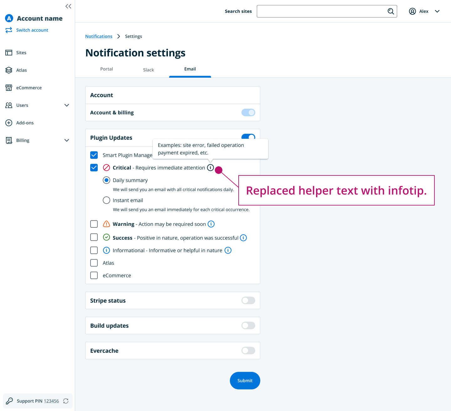
Added explanatory sidebar
Progressive disclosure of options
Scannable visual hierarchy
Clear interactive affordances

Results & Impact
The redesign delivered significant improvements across all key metrics:
User Engagement Metrics

Business Impact

Qualitative Feedback

What I Learned
This project reinforced several key lessons that I carry into every design challenge:
Research Drives Design Decisions
The combination of user interviews, analytics, and support data provided a complete picture that guided every design choice. Without this foundation, I would have been designing based on assumptions.
Balancing Simplicity with Power
The biggest challenge was reducing cognitive load while maintaining granular control. This taught me the value of progressive disclosure and smart information architecture.
Cross-Functional Collaboration
Working within a 16-person design team while owning a specific experience showed me how to leverage collective expertise while maintaining design ownership. Regular critiques and workshops elevated the final solution.
Business Impact Matters
Tying design improvements to concrete business metrics (support reduction, user engagement) helped secure stakeholder buy-in and proved the value of user-centered design.